Introduction
Customer Problem
One of the top priorities of Twitch creators is to engage and grow their audience. However, with the current tooling provided by Twitch we run into a few problems.
Creator Attention
Creators are using chat alongside multiple activity feeds to keep track of events happening within their community, as no single tool provides them with everything they need. They need to use Twitch feeds for events around rewards but a third party feed for donations. This adds to an already long list of things they need to pay attention to when live.
Persistent Event Management
Ongoing and upcoming events (polls, predictions, ad breaks, promotions etc.) are visible and managed mainly through chat or as stand-alone modules within the stream manager. Chat is one of the most important tools for creators as that is what they use to mainly communicate with their community. Covering it up with events takes up valuable real estate and they have expressed a desire to move this management somewhere else in user research studies. There are also no visible management controls for the creator when they show up within chat.
Lack of Feature Visibility
Creators miss out on new features built into our native tools and the value that they provide. A lot of new features that are added as stand-alone panels don't see a lot of adoption. This is due to these panels needing to take up valuable screen real estate while only being relevant contextually. This leads to teams forcing features into chat causing it to be too busy and missed within it as well.
Why a Combined View?
Survey Research
In a recent survey, Creators expressed that they need to use multiple 1P and 3P tools to track chat and events while streaming and that they would prefer a complete solution.
Live Site Experiments - Chat Highlights
Experiments with the chat highlights system proved that an improved creator-differentiated chat experience could improve the outcomes for streamers.
Concept Study
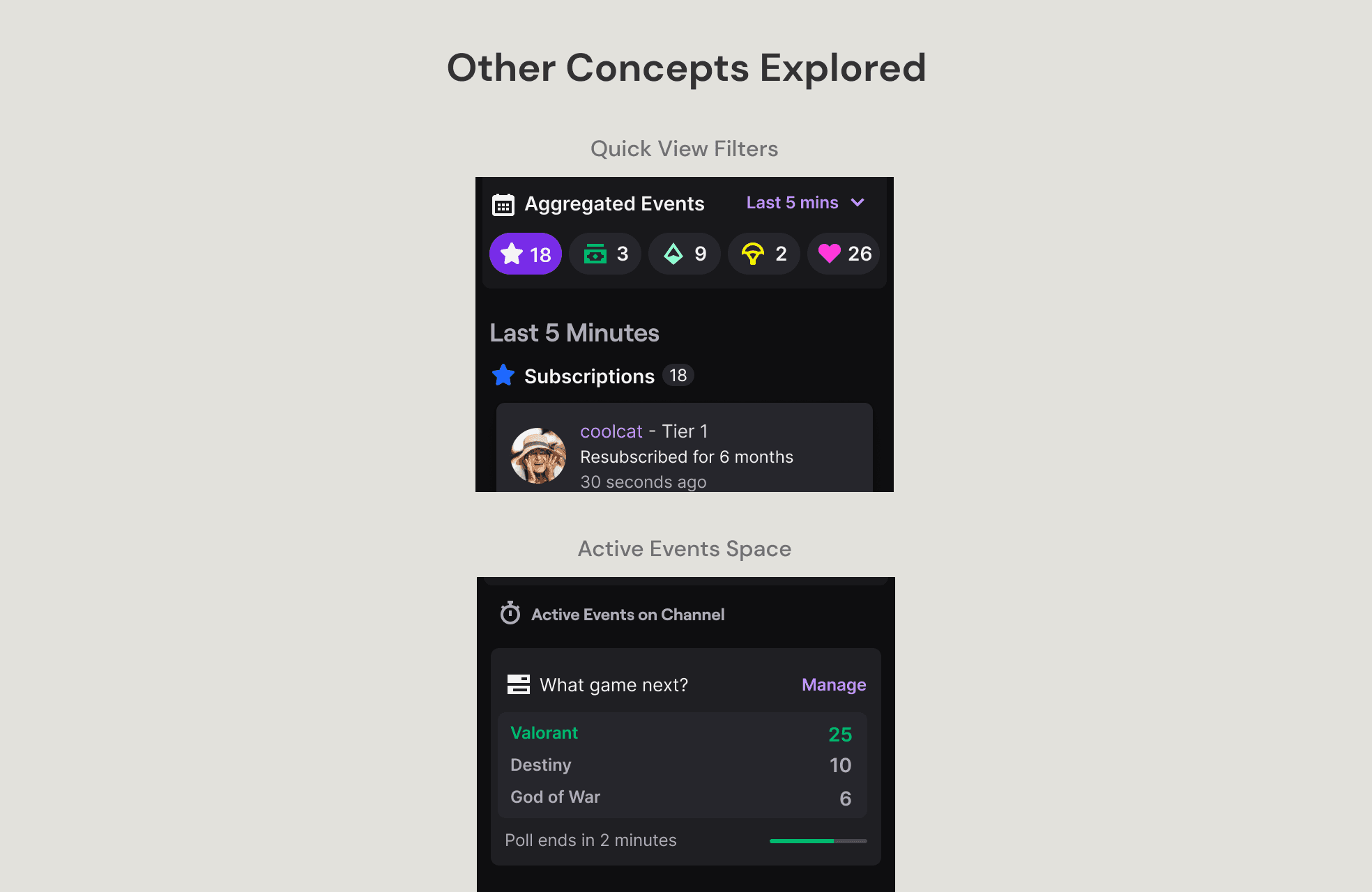
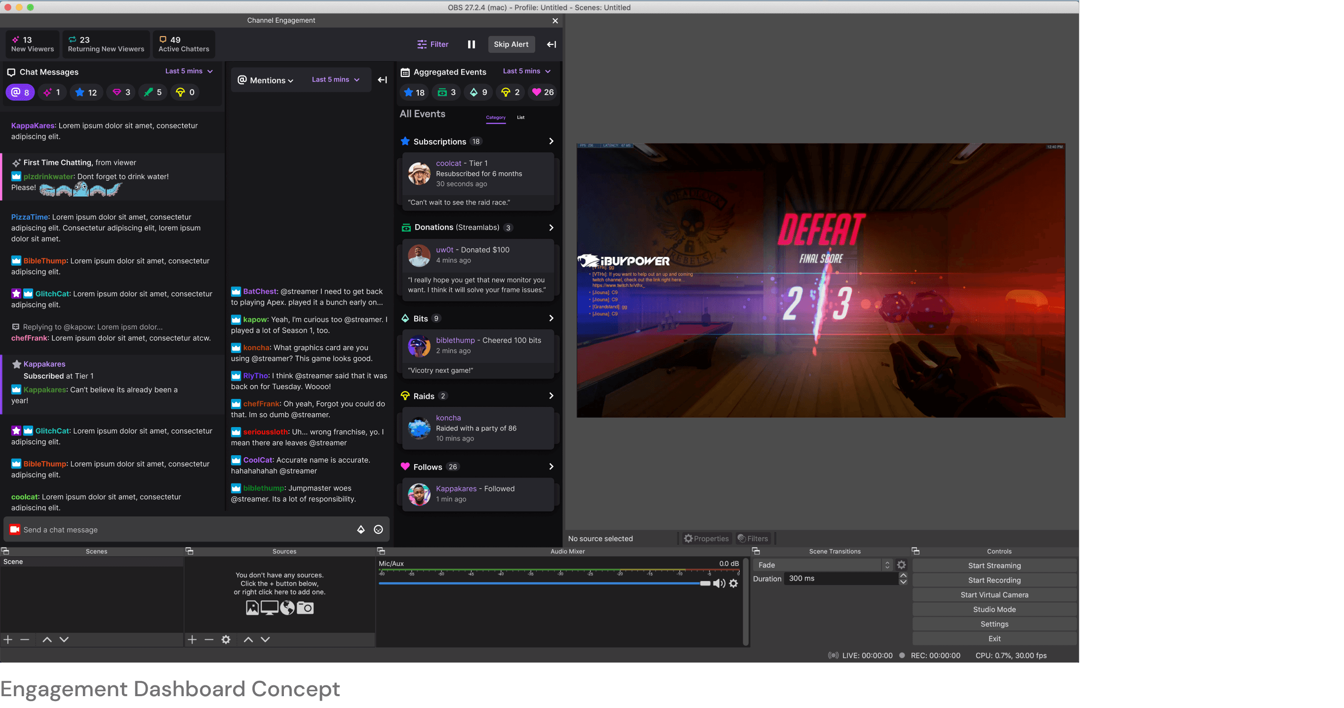
I ran a user research session to test concepts with a combined chat and activity feed in something we called the engagement dashboard. This dashboard was very well received by our participants and them wanting a complete solution was echoed here as well. Also, this study led to teams building other features like a follow reminder. Below are some of the concepts that we explored in this study.
Live Prototype Study
As this would be a a significant change to our creator tooling, we wanted to make sure that the combined feeds was the right path to go down. To this end, in partnership with research and engineering we ran a live prototype study with 20 creators. The prototype study was a success with >70% satisfaction rate. Creators really liked that the feeds were combined and some of them continued using the prototype even after the study concluded.
Details
Initial Plan
With all the data we had gathered through our studies and surveys, I presented our initial plan to move forward to design leadership. The initial plan was to launch a combined feed that was portable and built to have flexible surfaces. There would be some design clean up to the panel but it would largely resemble the one shared during the live prototype study.
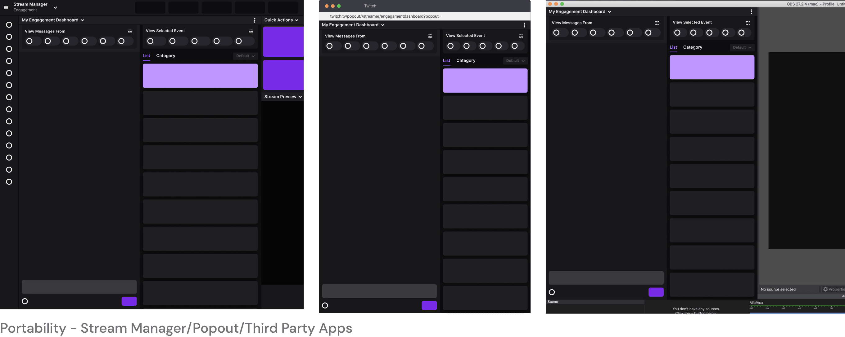
However, we hit a few roadblocks here with design leadership. The big one was that we needed to be careful when building another surface for creators to look at. If we felt this was going to be the thing to use, we should build it to eventually replace chat. So far our combined view was a double column design. For us to replace chat we would have to create a single column version as well. With that in mind we decided to to address the design feedback and look into rolling out the product in phases.
New Rollout Plan
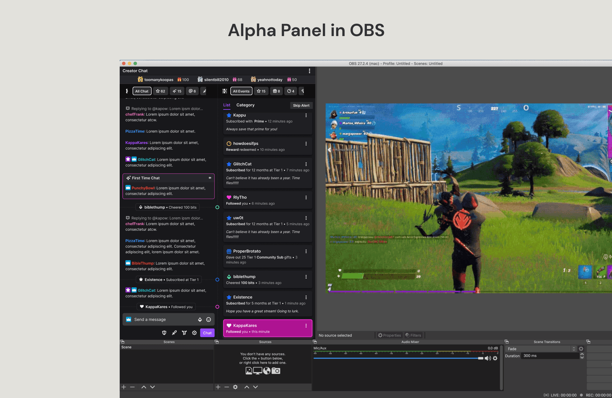
Alpha - This would address the design feedback for the combined double column view and we would use it to gather feedback from 60ish creators.
Beta - If we received a satisfaction rating of >70%, we would release the double column view to 20% of our creators. In this phase is when would add flexible spaces to help with management and important notifications.
Launch - If we saw a >70% retention rate, we would release the double column view to all creators with a 'beta' tag. Once launched, we would work to flesh out the single column designs to eventually replace chat with the new panel.
Alpha
The alpha designs went through a few rounds of iteration. They culminated in a usability study that I ran with creators to make sure that the changes we were proposing made sense to them. Below are summaries showing the updates that were made over the older designs and how our study participants reacted to them.
Combined View
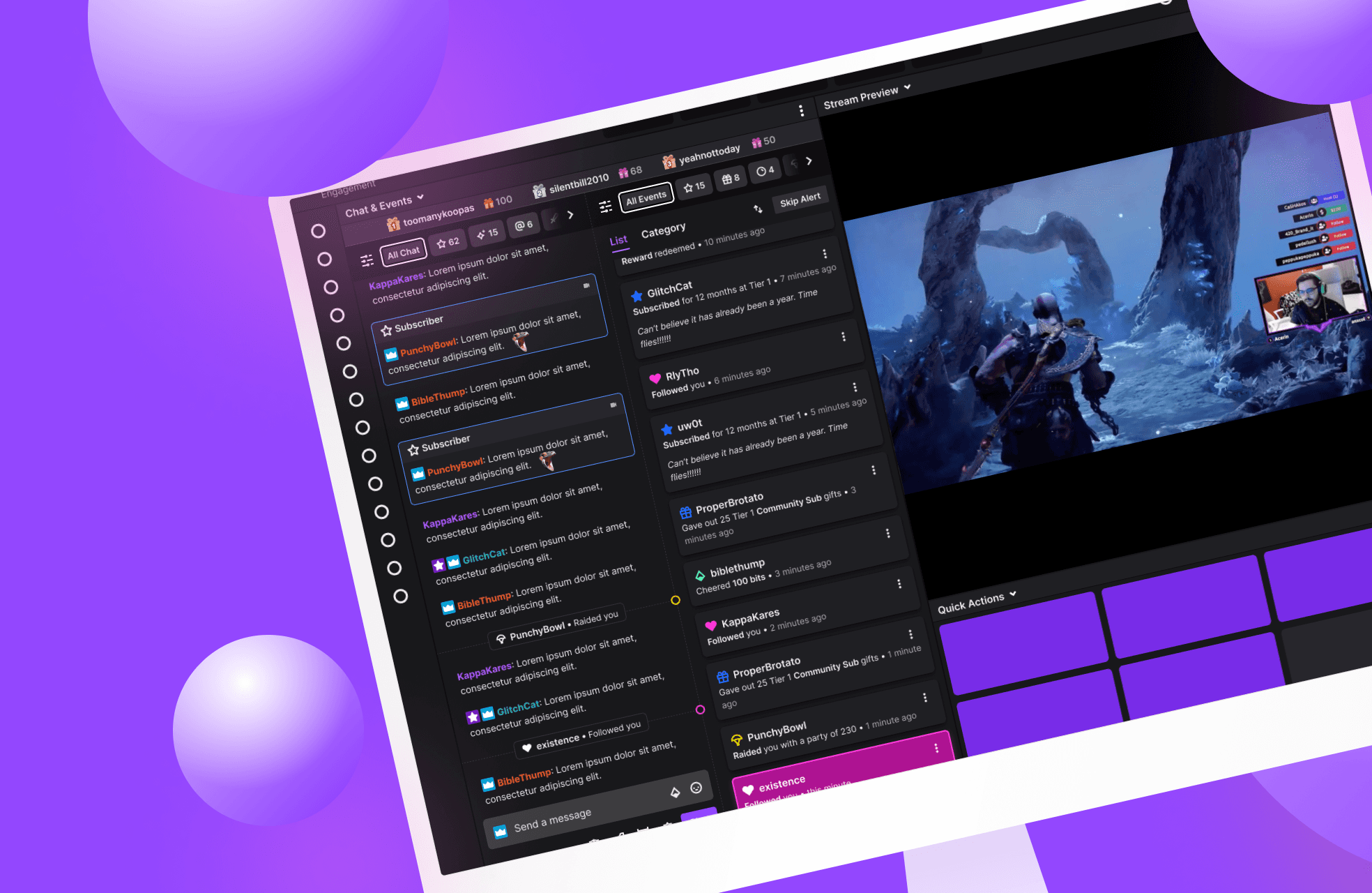
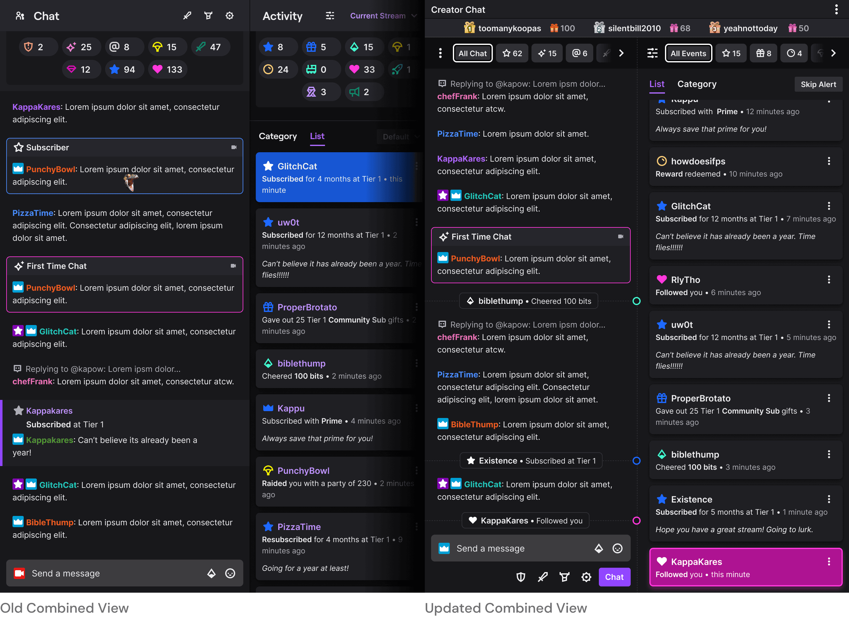
The essence of this feature is the combining chat and activity feed (events) into one view. For the prototype study, we did not make any changes to the chat side of the column. We updated the events side to use a more modern card design as we heard that creators preferred the more visual style 3p apps used for event feeds. The issue with the prototype study design was twofold. The first is that your events show up in chat as well as a user notice. In the image below that is the kappakares subscribed message. However, this was starting to feel duplicative as this information is showing up in the events feed right next it. The other issue is that chat scrolls in from the bottom and the events feed scrolls in from the top. This meant that creators would have to shift their focus to pay attention within the same panel.
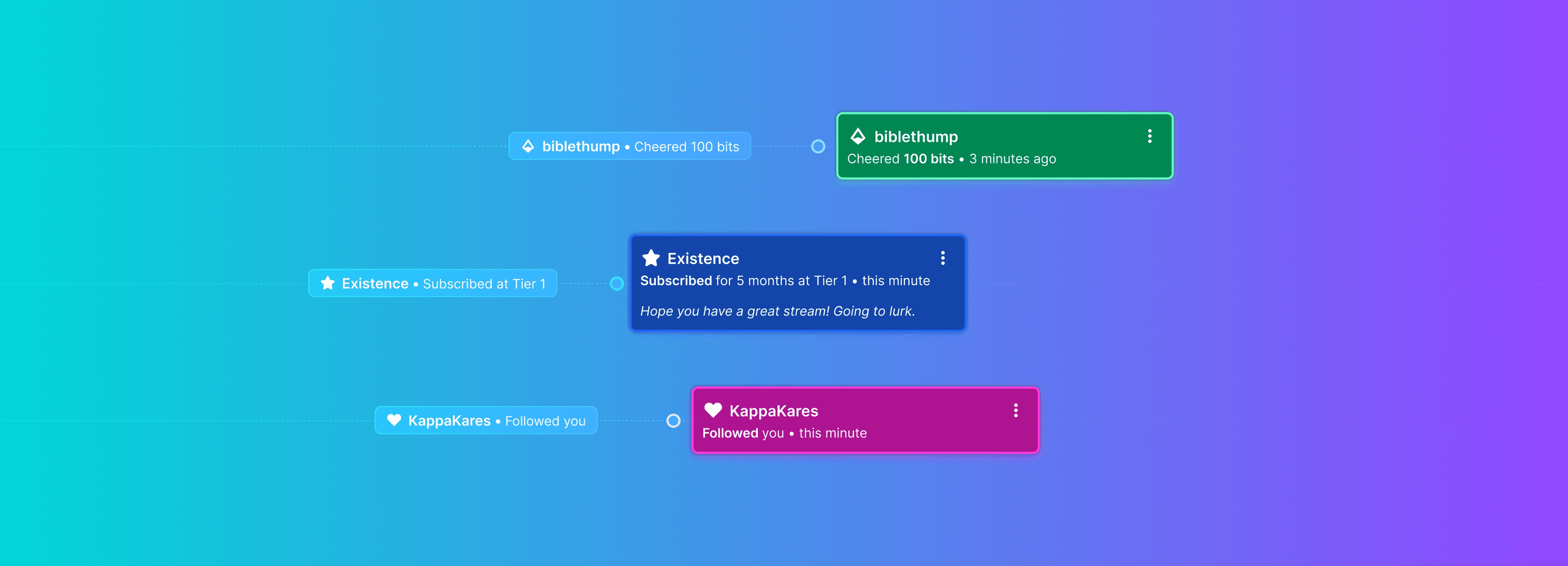
Taking out the user notice from chat would have been the easiest way to solve the duplicative issue. However, from research I knew that creators still wanted to see information about an event show up within chat to help them create a timeline. As such I ended up creating a minimized event within chat with a marker to create the sense of a timeline. For the scrolling in issue, I decided to make the event feed match chat and scroll in from the bottom. That way a new message, new minimized event and event card came in from the same direction. I chose the direction of chat as the default because that is what creators are looking at the most and it is also a lot more active than an events feed. I did eventually add a way for creators to flip the order if they wanted to in the future.
Usability Study Notes
- Creators really liked the new scrolling direction.
- Creators liked the minimized events in chat and did not miss seeing additional information within chat.
Quick Views
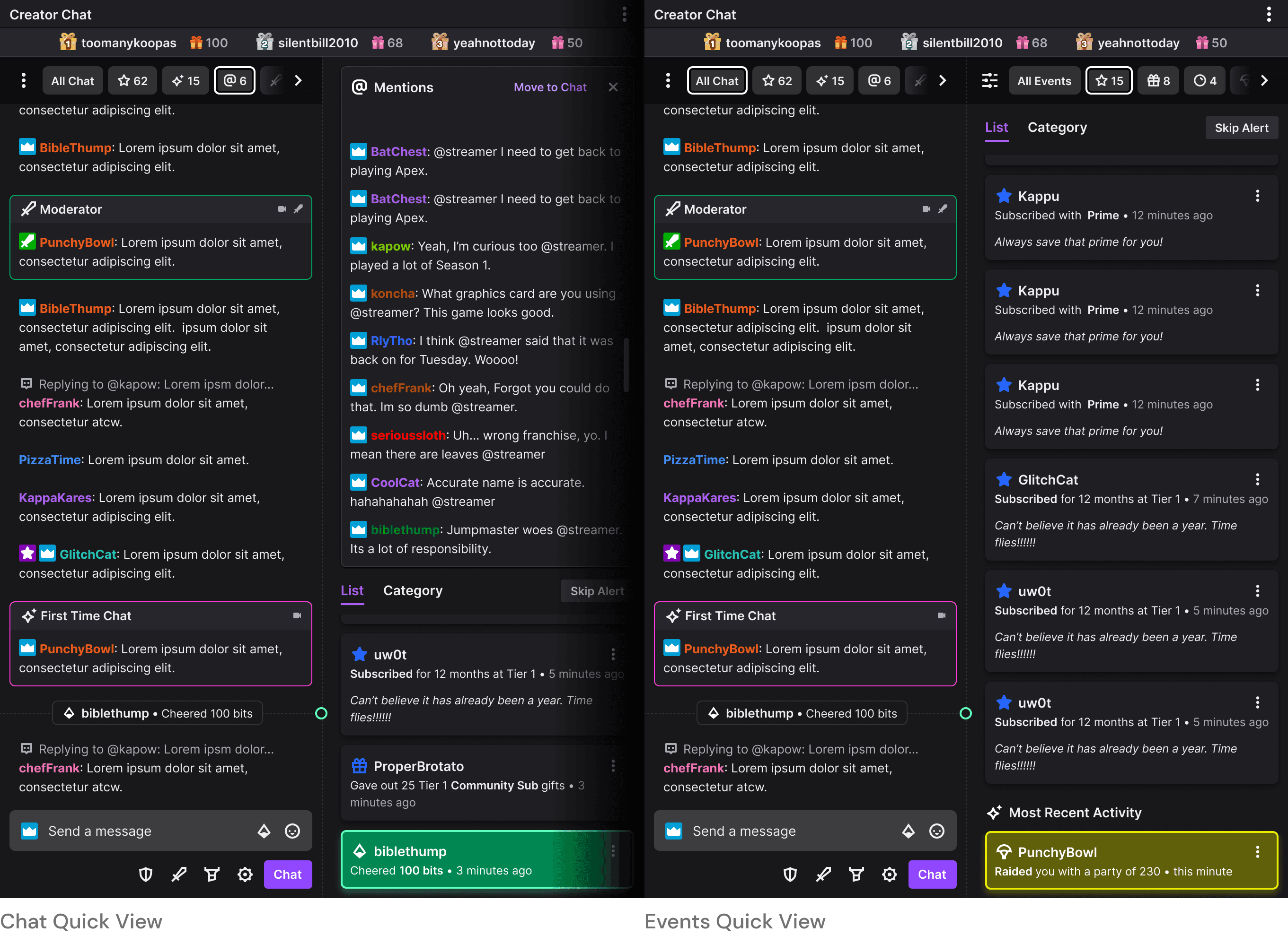
The quick view section (top section with the pills & icons) in the old prototype study designs took up too much vertical space, were not clear enough in what they did & were too colorful. For the updated designs, I took inspiration from the a lot of other websites handle filtering. I reduced them all to one line and changed the first pill to say 'All' to help creators understand the function of the pills. I also worked with engineering to make sure that creators could sort these pills in the order they wanted, either through a dropdown or by dragging it in place.
Clicking on a quick view pill within the chat section would open up a panel with messages from that viewer type in the events feed section. The events feed would scale down to a minimum size that would always at least show the last 2-3 events. I moved it over to this section as having a chat feed that is not covered is very important to our creators. Clicking on a quick view within the events section would show only events of that type. The bottom would change to always show the creator their most recent event.
Usability Study Notes
- Creators clearly understood what the quick view section would do for them.
- The filter menu that contained the sorting and toggles made sense to the creators.
Discoverability
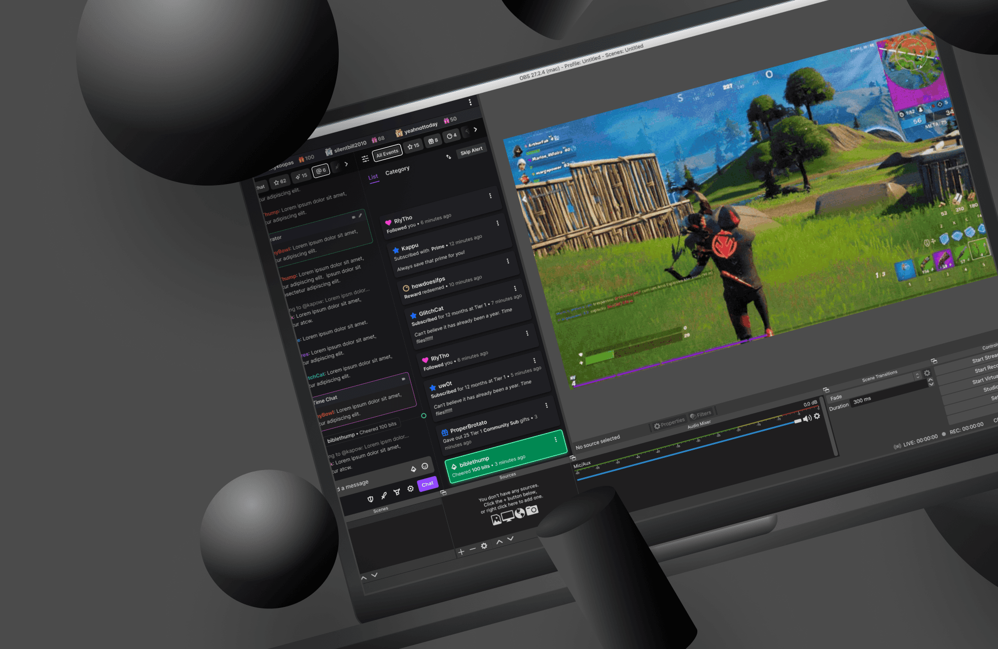
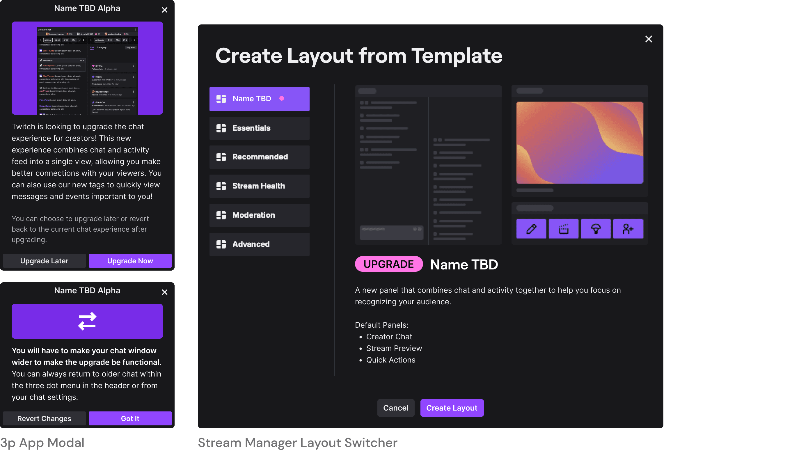
With a single column taking over existing chat we would not have to worry about creators discovering this panel. However, we needed a way for them to discover this for the time being as single column was not coming until post launch. To accomplish this, we surfaced upgrade modals to our creators. Within Twitch's stream manager we could easily guide creators to a template switcher and control the sizes for them. However, within 3p apps they would need to change the size of their panel as this new panel would replace their chat and chat is skinnier than a double column. Most creators would see this before they were about to start streaming and I added a way for them to quickly revert the changes in case they did not want to deal with it then. After that they could upgrade whenever they wanted through chat settings.
Usability Study Notes
- Creators did not find this disruptive to existing setups.
- They appreciated the ability to upgrade later and to revert changes.
Details
Beta
With the Alpha being an overwhelming success (>70% satisfaction rate and positive feedback), we decided to move forward with the beta release. For the beta we wanted to add in the ability to notify creators about contextually important things and to manage things like polls/predictions etc from the panel itself.
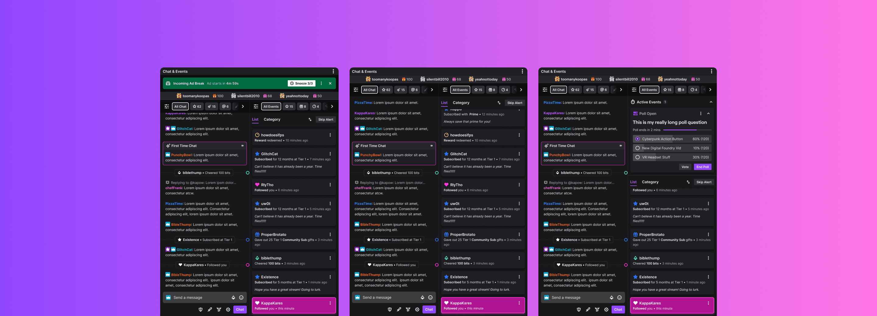
Live Events Space
The live events space would be a collapsible space that would only show up when needed. It needed to house all live Twitch events. As such, I created a template structure that would work for all them. I also added in the ability to manage the event so that creators did not have to go to another surface.
High Priority Moment Space
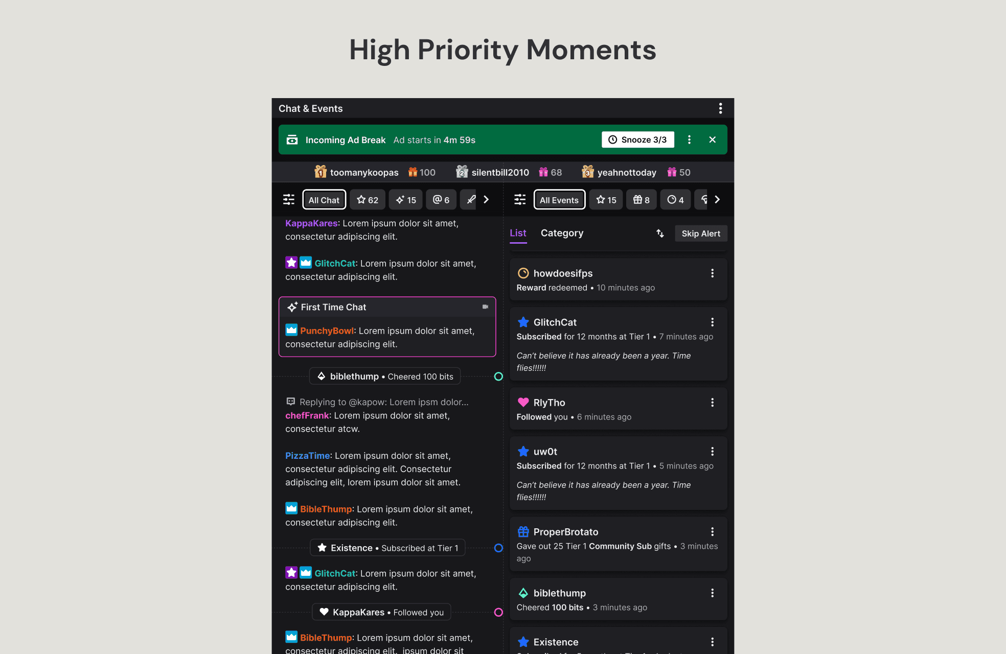
Anything that would require a creator to take action on would show up in the high priority moment space. As this is the highest priority for them, I designed this space to show up at the top and take over the whole width of the panel to grab their attention. This event would also have controls to help the creator manage it from within the panel itself.
Conclusion
The results from the Beta were very promising. The 1-7 day retention rate was at 93%. This showed that people who actually used the product found it to be very useful in their setup. We also sent out a couple of surveys during the beta period and had a very high satisfaction rating.
With those results, we are planning on launching the double column in beta form to all Twitch creators. Before it goes out, we are planning on adding in a way for creators to manage their rewards redemption from within the panel itself. In the past, creators would have to open a panel dedicated just to managing these redemptions. We also have other teams utilizing the high priority moments and active events spaces.
After the beta is fully rolled out, the plan is to work on a single column view of chat & events & address any feedback received from our creators. With this being completed we can replace the existing view of chat on the creator side with the new and improved panel.
