Introduction
Customer Problem
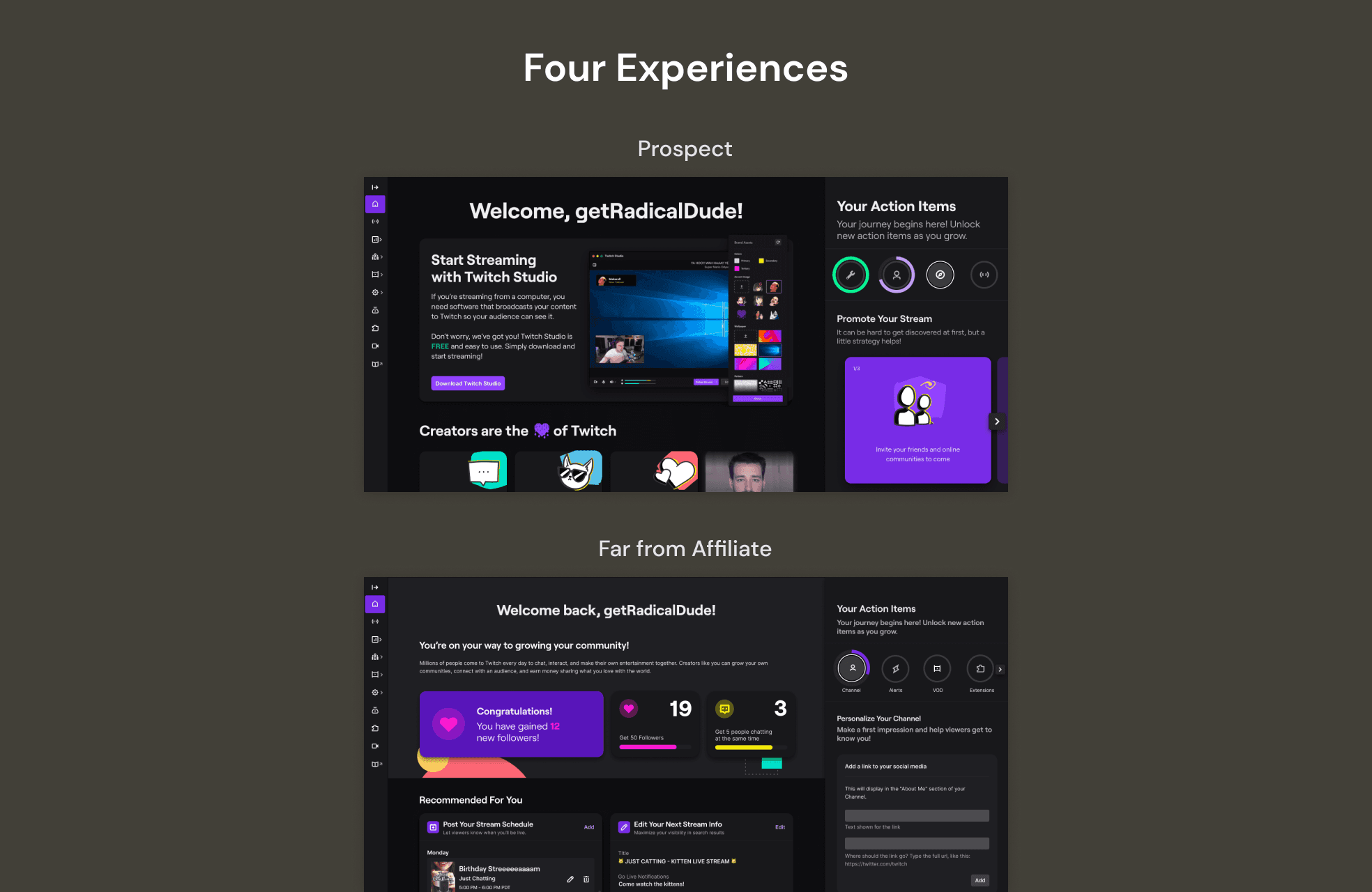
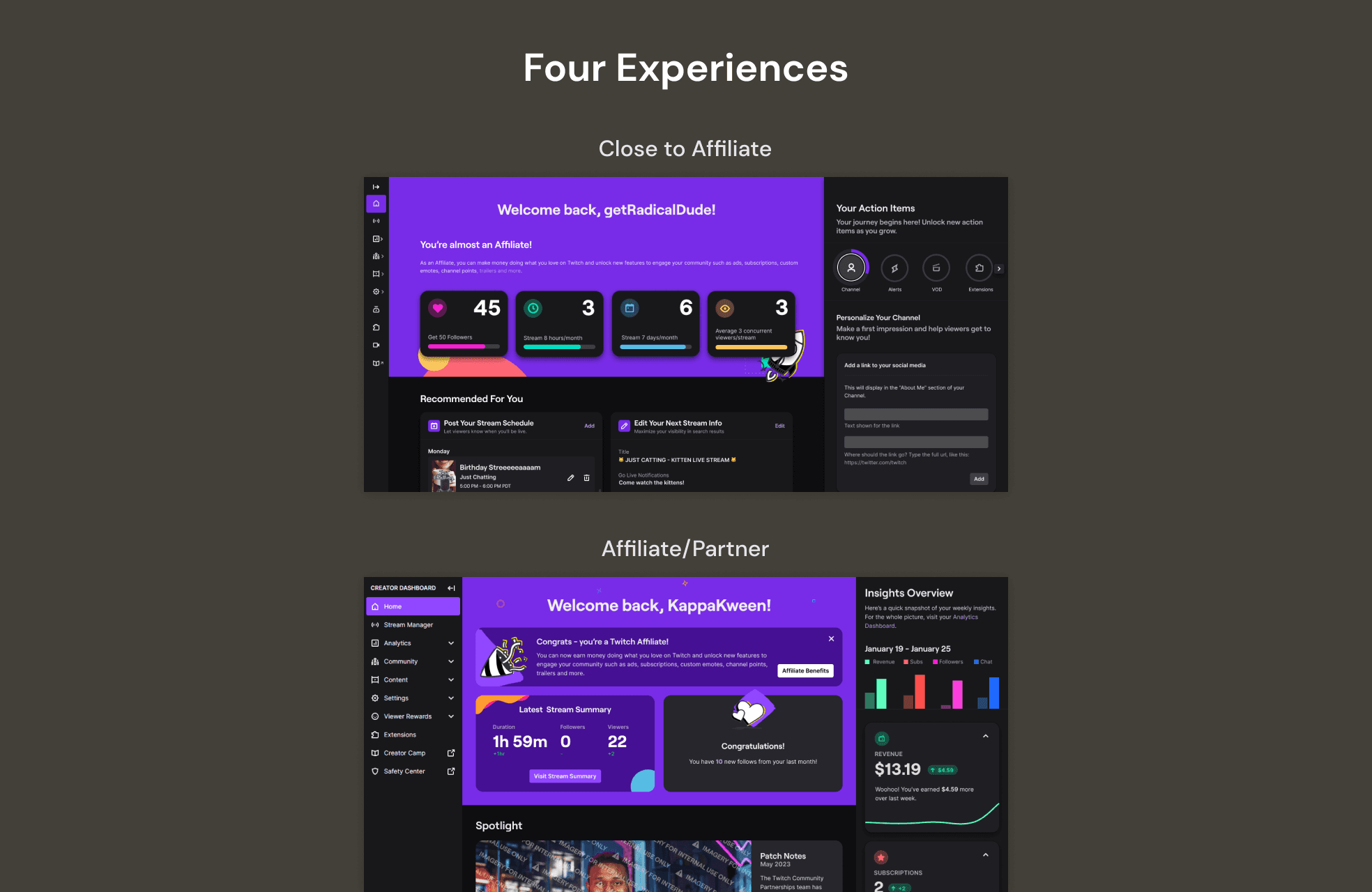
With four separate experiences on web that are defined by creator segments, the page changes can dramatic and jarring when creators move between segments.
- For example, 49% of pre-affiliates set their stream schedule via a home panel, but this panel disappears when they graduate to Affiliate.
Benefits
The benefits for the unification of these experiences was twofold. The first has to do for our creators. With a stable surface we can surface relevant content to our creators depending on their lifecycle. They can focus on recommended actions and insights instead of trying to understand changes to home.
The second benefit was to our business. With just one experience we would be reducing our tech maintenance and debt. We would be able to ship new features across different creator segments without additional engineering work.
Details
Addressing Existing Issues
To unify our experiences in to one, we decided to use the Affiliate/Partner experience as the base as it had the most features, a lot of design thinking, it was built to be scalable and had the highest engagement.
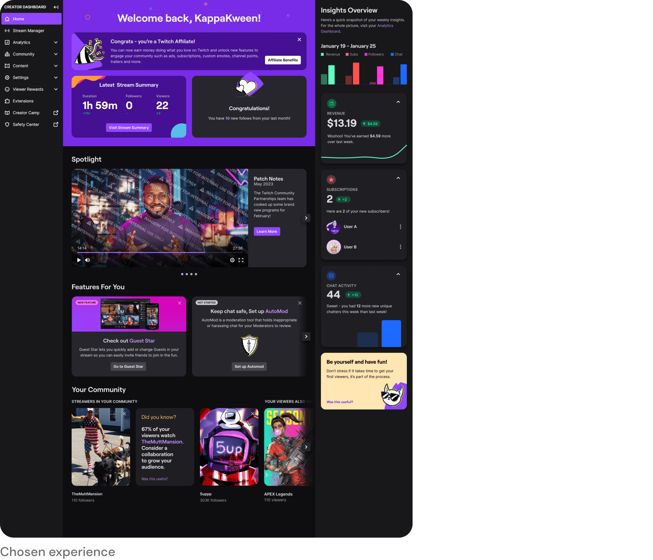
However, this experience had a lot of issues that needed to be addressed. These had to do with:
Theme
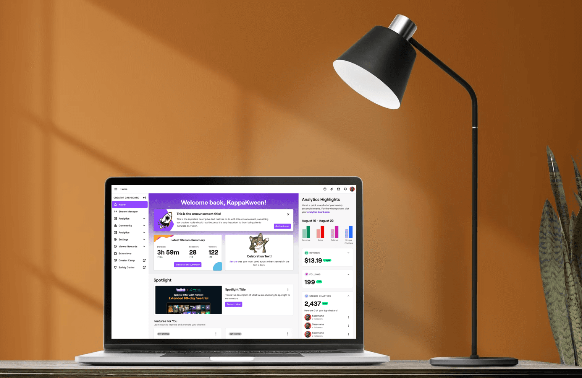
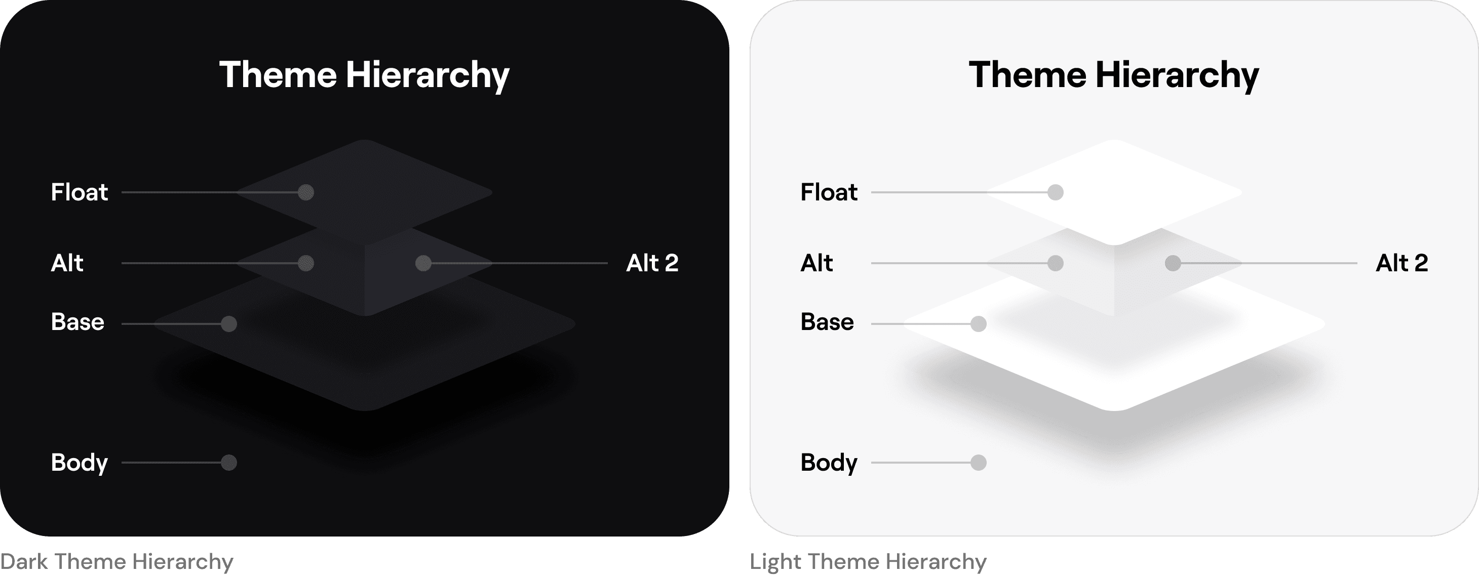
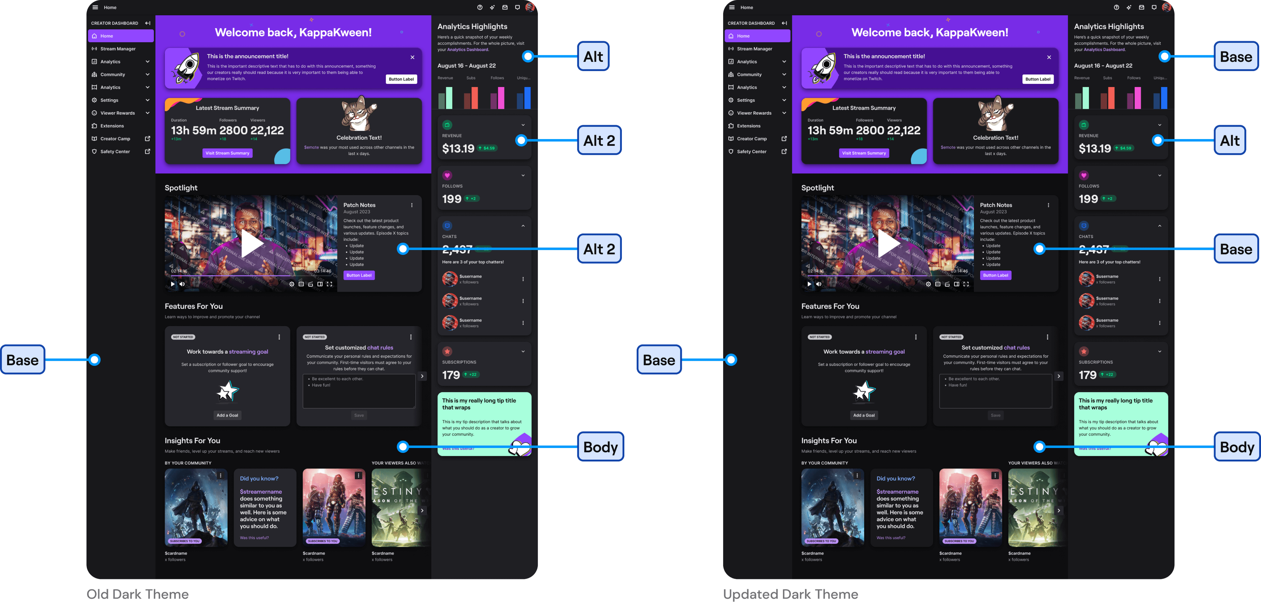
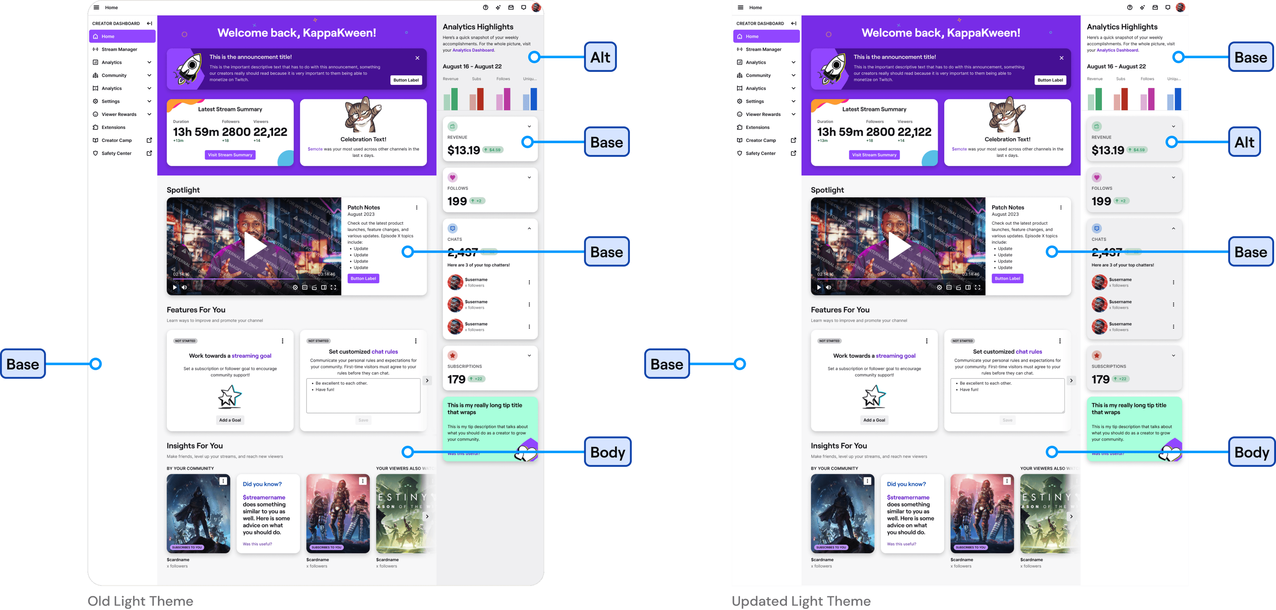
Old home did not follow our design system theme hierarchy. It also used different logic for the light and dark themes. This caused for a jarring experience when a creator navigated away to a different page. This issue was addressed with the unification and now matches the rest of the dashboard.
Consistency
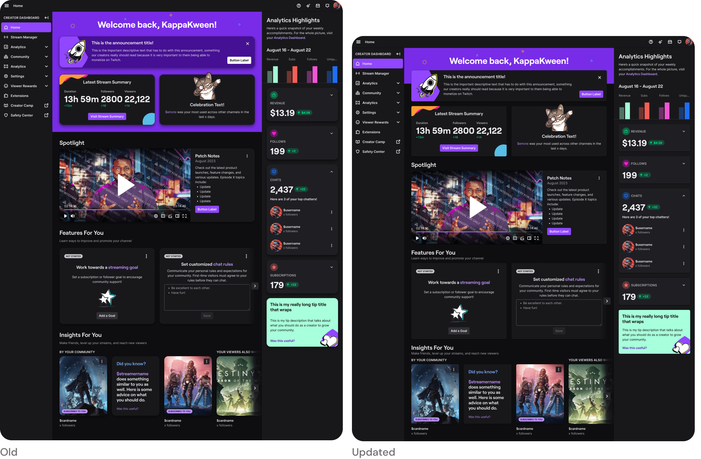
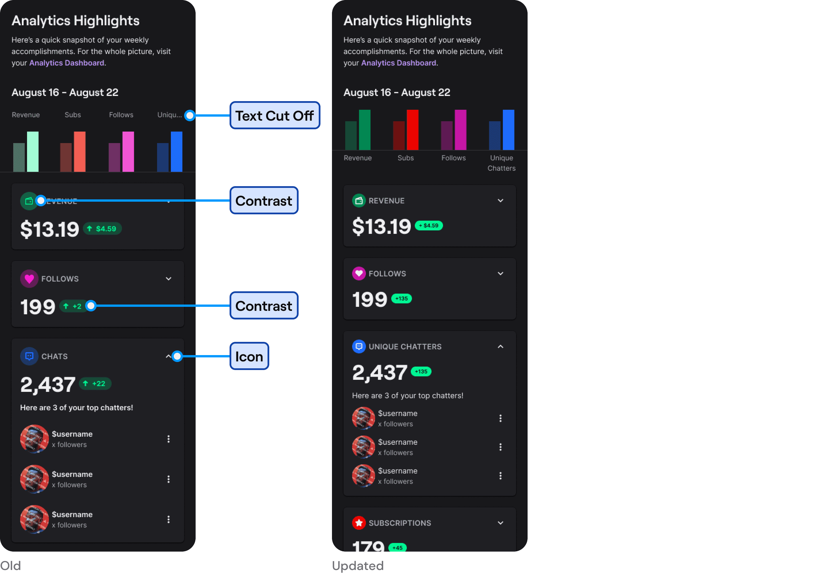
Spacing - Old home was using almost double the spacing compared to the rest of the dashboard. I brought this down to match the rest of the dashboard. This also allowed for more information be visible above the fold. I reduced the height of the purple container as we had heard that it felt like 'too much purple' when first landing on the page.
Corner Radius - The corner radius was matching our mobile UI, which made our cards much rounder than the rest of the dashboard. I reduced the corner radius back down to match the rest of the Twitch web experience.
Elevation - The elevations was closer to our mobile UI as well, which made our cards feel extra floaty. I ended up reducing the elevation to match the rest of our experience on web.
Accessibility
Most of the colors used within old home were not accessible. These issues were prominent within the elements in the analytics highlights section. I did a pass of them to make sure we were reaching the right contrast ratios.
Other Improvements
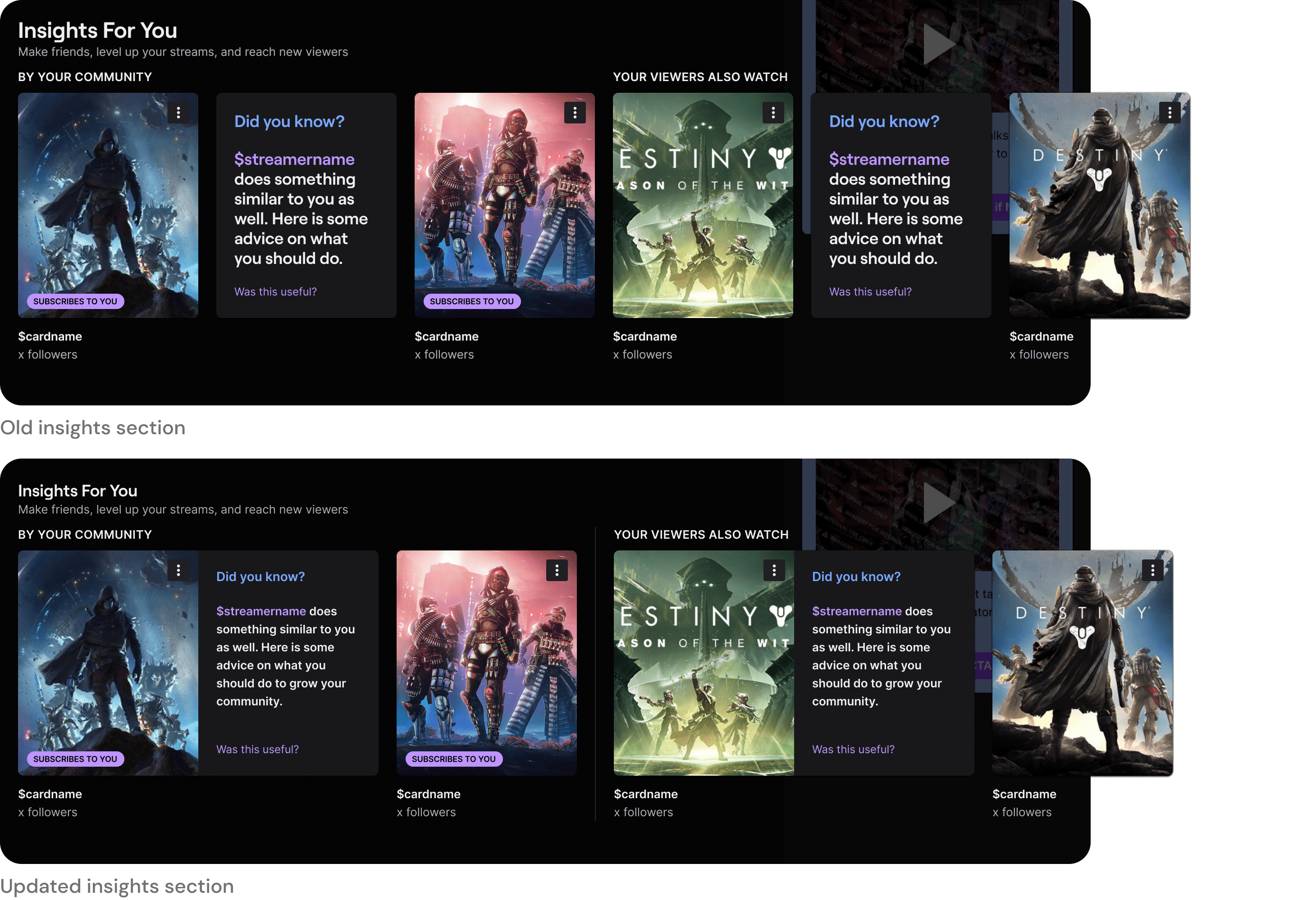
I slightly reworked the insights section at the bottom of the page to increase the separation between sections. In old home cards that were meant to be one were split into two, and there was no clear separation between subsections.
Feedback & Updates
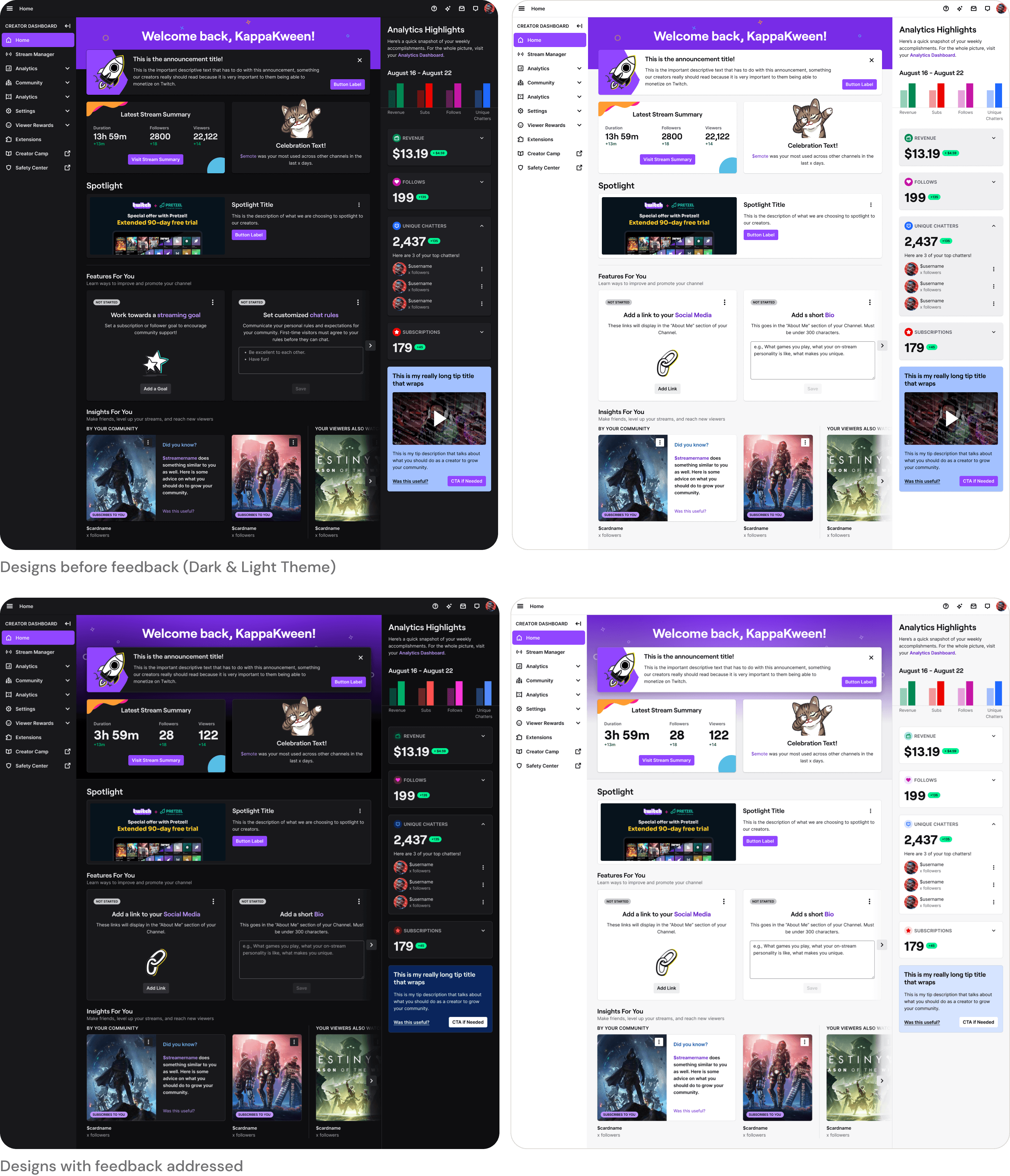
I took the above changes to our internal design review held with design leadership. While most of the team were in agreement with the updates, there were some minor pieces of feedback that I needed to address.
Flattening & Contrast
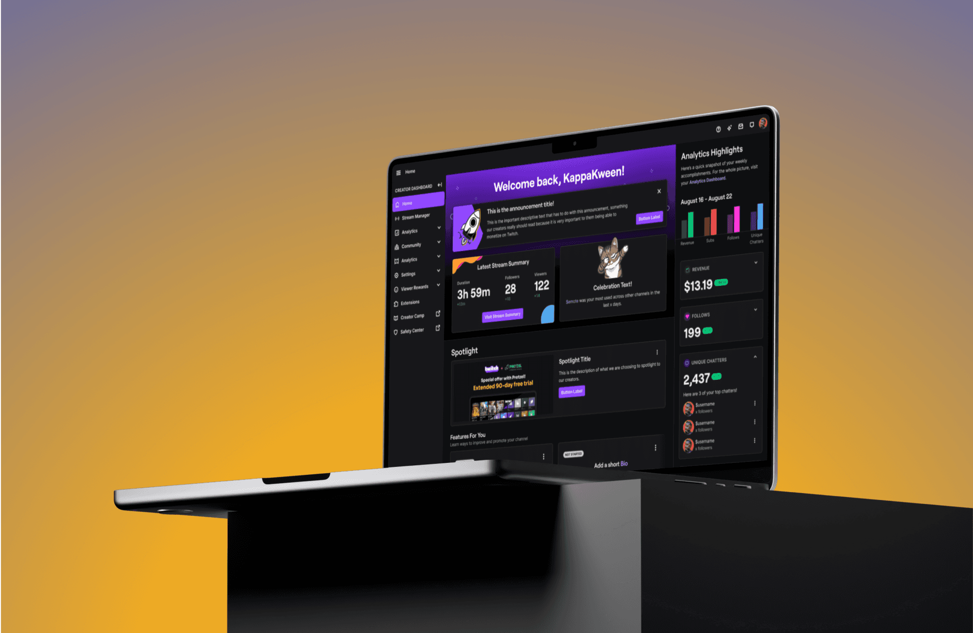
With the updates, the experience was starting to feel a little flat. While the hierarchy of the theme was now correct, there was a reduction in contrast between the cards and the background. To address this feedback, I decided to use a border on the cards instead of elevation. This drastically increased the contrast.
Color
While the colors were now accessible, they felt a little dull and had lost some of the brightness. I took another stab at the colors to bring back this 'joy' to them.
Purple Background
Making the purple box smaller made sense but it was no longer serving a purpose. In the older designs it served the purpose of being a container to the top section. I updated this to be a gradient so as not to have too much purple and back to being a container for the top section.
Details
Unifying Experiences
After addressing all the existing issues, I could move forward with unifying four experiences into one.
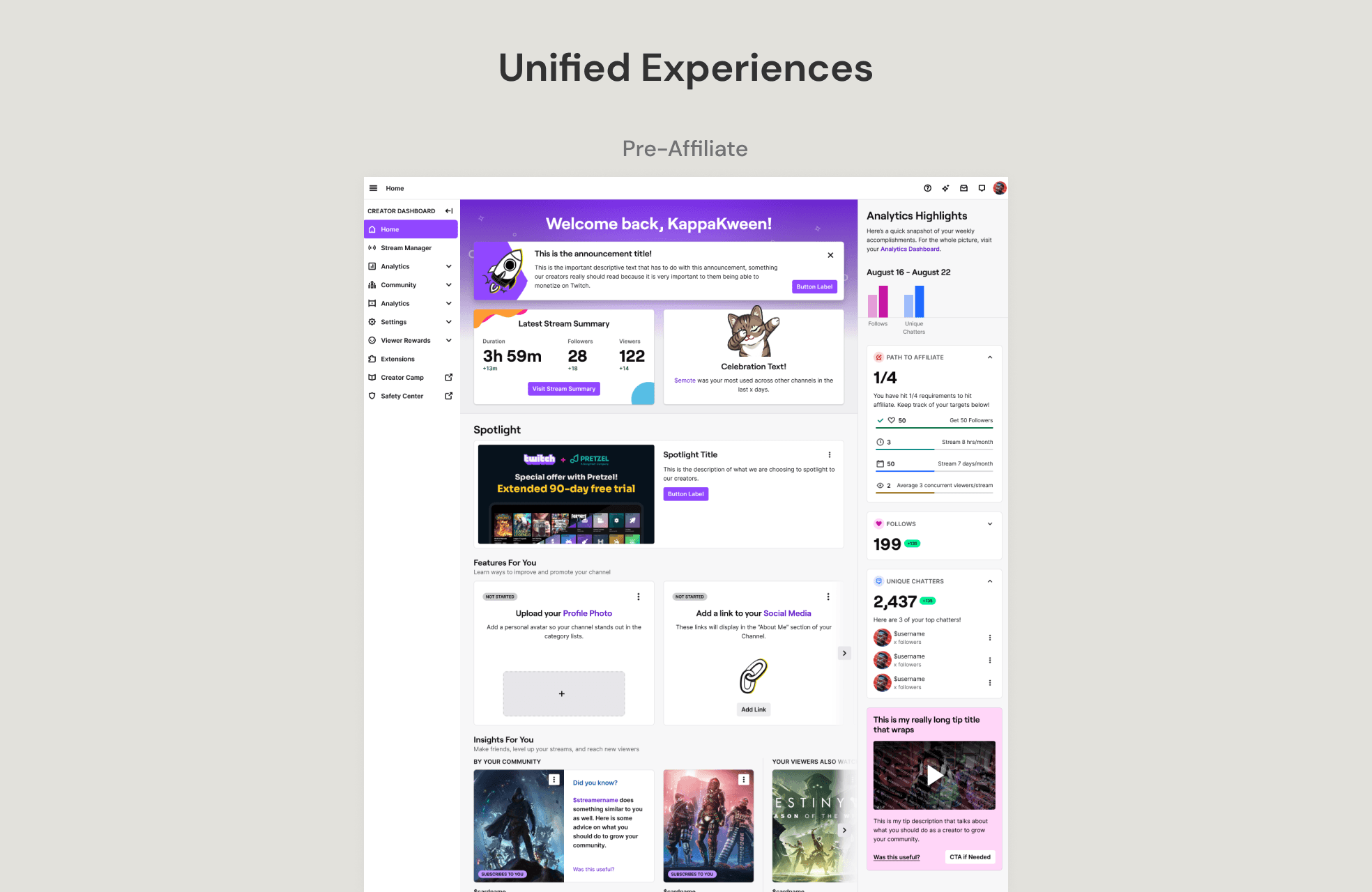
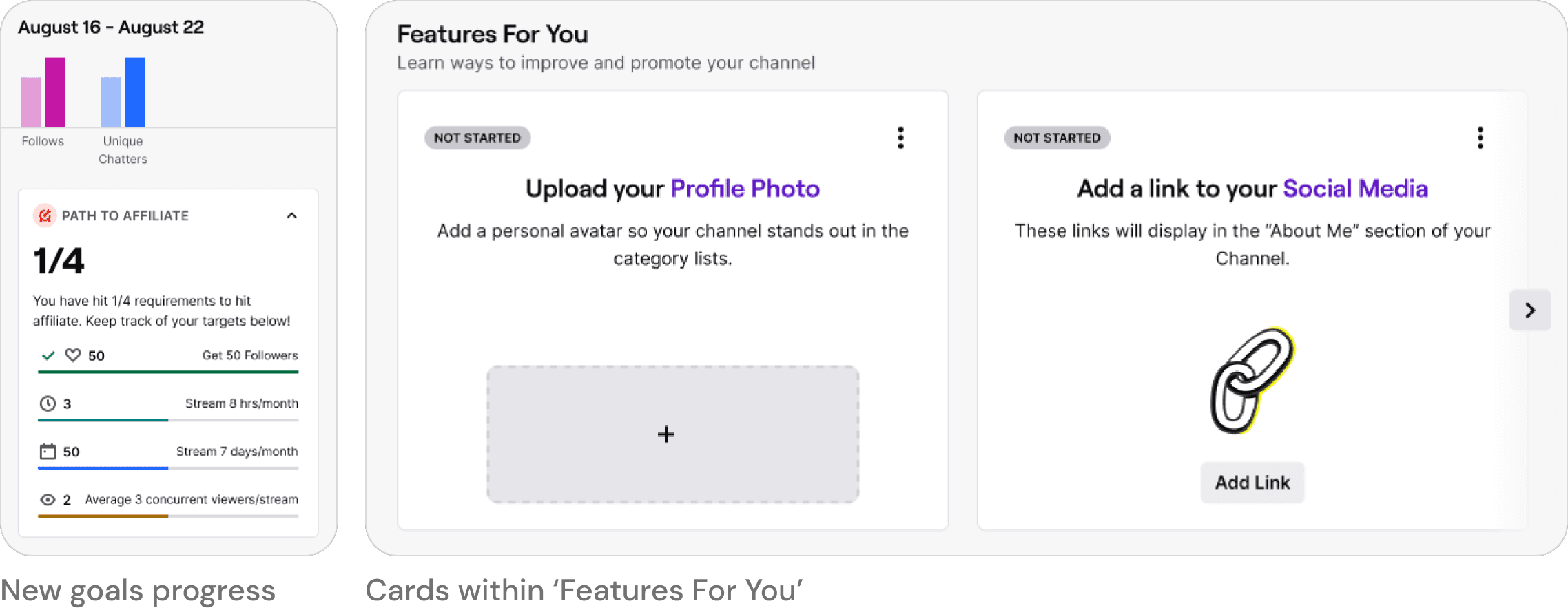
For the Pre-Affiliate experience I had to bring in their goals progress (Path to Affiliate) and features exclusive to them.

The features were easy to bring in as I could add them to the features for you section as cards. For their goal progress, I decided to move it to the analytics highlights section instead of squeezing it into the top section. I did this to help get creators used to looking at this section for helpful actionable insights as they keep growing.
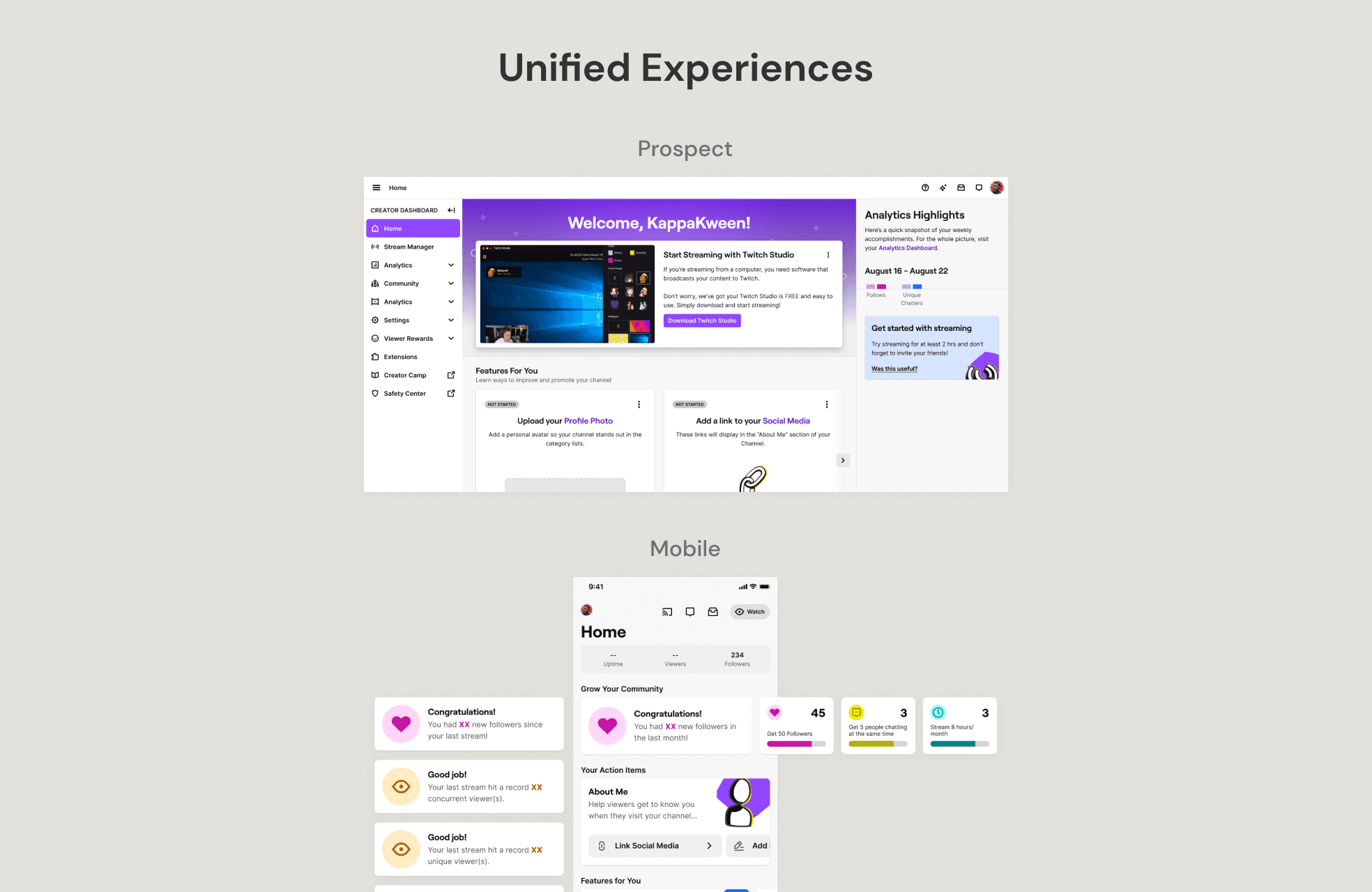
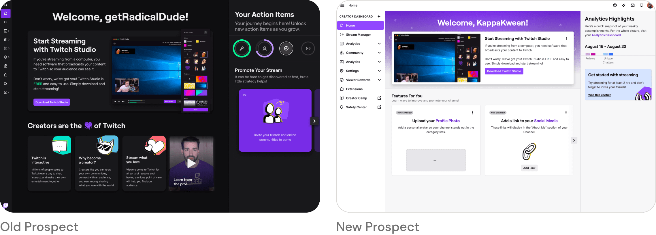
The Prospect experience fit in quite easily into the new experience. It gives our creators a glimpse into how this page might grow but also helping them get started with streaming.
Mobile Tweaks
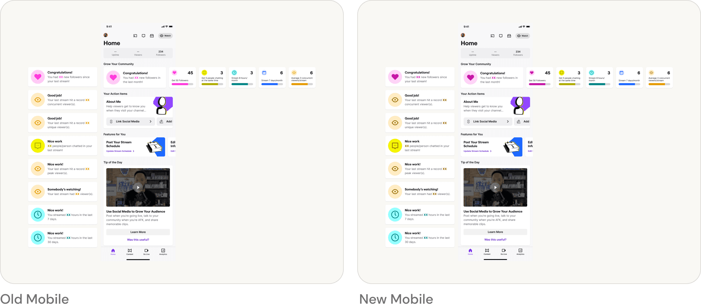
Our mobile app did not suffer from having multiple experiences. However, with consistency being a major influence for this work I needed to update the colors within the mobile app to match the updates on web and address any accessibility concerns. In particular, I had to update the impact cards and the goal progress cards. Having a mobile app with the same styling creates a more holistic experience for Twitch creators.
Conclusion
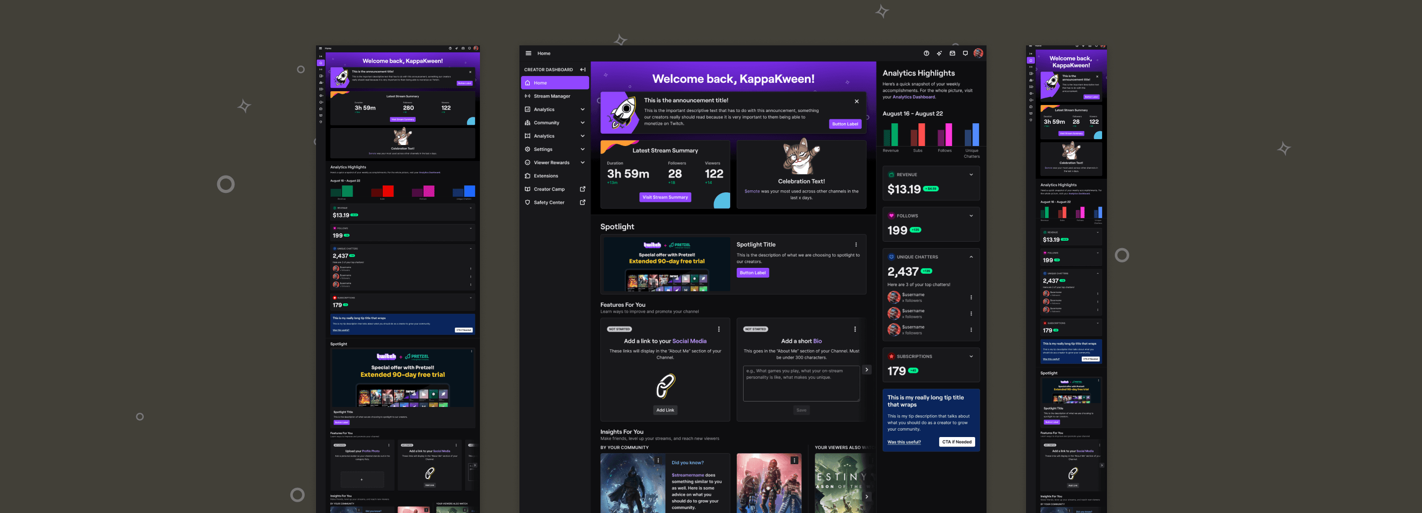
The unification of our experiences into one has allowed for the engineering team to ship features out to home quicker than before. This unification also provides us with a solid base to improve the home experience for Twitch creators while being consistent and accessible. One of the big things that we want to improve is surfacing contextually important information to our creators on this page and tying that into features that will be useful to them.
